Product description page

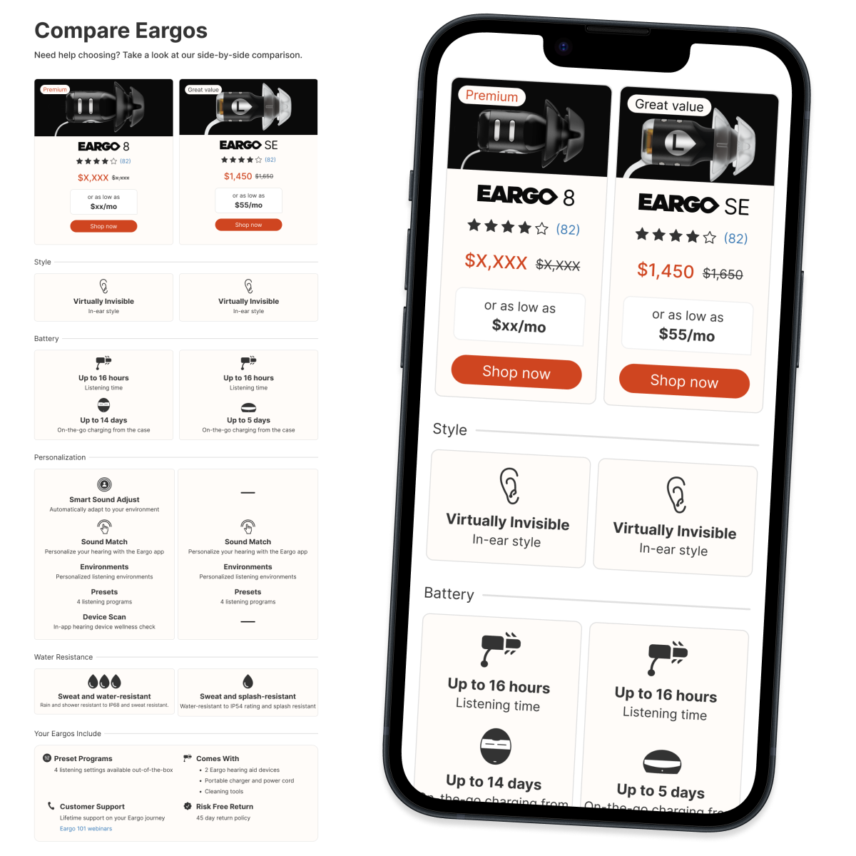
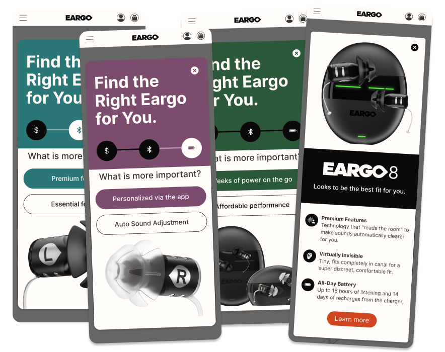
Research revealed shoppers wanted product information in plain, everyday language—free of industry jargon—while still being able to dive deeper into the details that mattered most to them. I redesigned PDP hierarchy and storytelling into two templates: a richer, more detailed version for our flagship product to spotlight its added value, and a simpler, streamlined version for the rest of the line.

Problem
  • Unclear value — shoppers struggled to understand what set each hearing aid apart
  • Too much to digest — dense, unstructured content overwhelmed shoppers before they could decide.
  • Look-alike products, different prices — visually similar products with very different price points made comparison difficult.
Solution
  • Flagship template — polished assets, richer content, and animation to tell the story behind the higher-priced product.
  • Standard template — a more static, direct content approach for the rest of the product line.
  • Plain, benefit-first language — replaced industry jargon with common terms, leading every statement with the benefit to the shopper to build up product value.
Outcome
  • More time on page — shoppers engaged more deeply with the content.
  • Fewer support calls — fewer shoppers needed to call in with product questions.
  • More website orders and better conversion — clearer content moved more shoppers to purchase online.
  • Increased trust — shoppers felt more confident they were making the right decision.

A faster checkout built to convert

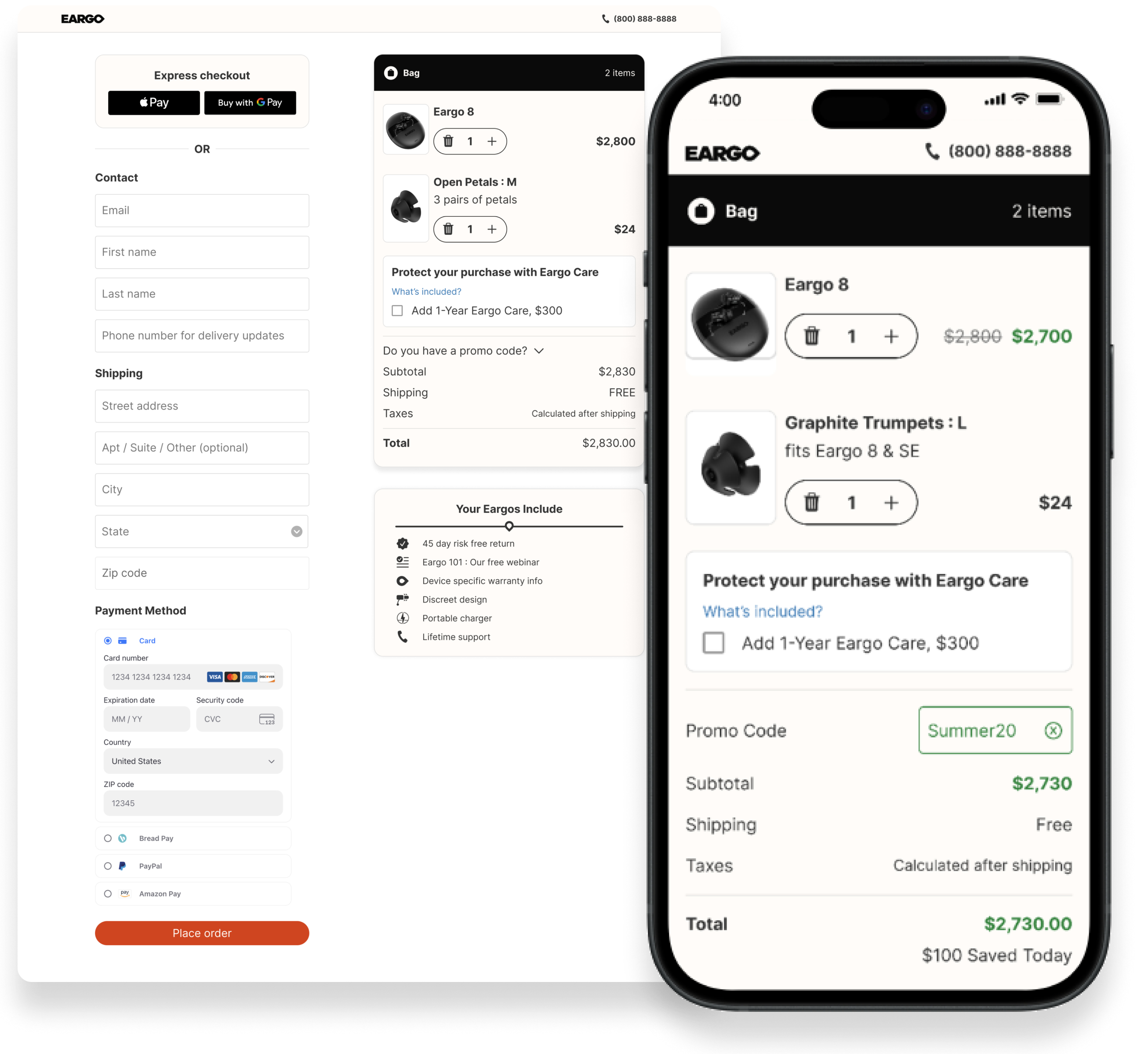
Data showed 90%+ of orders were single-item, making a multi-item cart unnecessary. Removing it and simplifying checkout increased conversion and reduced time to purchase.

Problem
  • Too many steps — shoppers moved through a separate cart page before checkout, adding an extra decision point that slowed them down.
  • Busy, cluttered design — dense layouts and competing visual elements made it hard to focus on completing the purchase.
  • Value not reinforced at checkout — pricing, shipping, and product benefits weren't visible where shoppers needed reassurance most.
  • Limited payment options — a narrow set of payment methods created friction for shoppers who preferred other ways to pay.
Solution
  • Removed the cart — shoppers now go straight to checkout, cutting an entire step from the path to purchase.
  • Simplified the design — an intuitive, streamlined flow that's easy to understand and follow from start to finish.
  • Added more payment options — elevated financing choices so shoppers can pay the way that works best for them.
  • Built in trust and value — clearer confirmation of what shoppers are receiving, with free shipping and discounts highlighted throughout.
Outcome
  • Buy Now, Pay Later adoption increased — clearer financing options at checkout removed a major barrier to purchase.
  • Conversion increased — the simplified, cart-free flow made it easier for shoppers to complete their purchase.
  • Time spent checking out went down — fewer steps and a clearer design got shoppers through checkout faster.

Eargo Mobile App

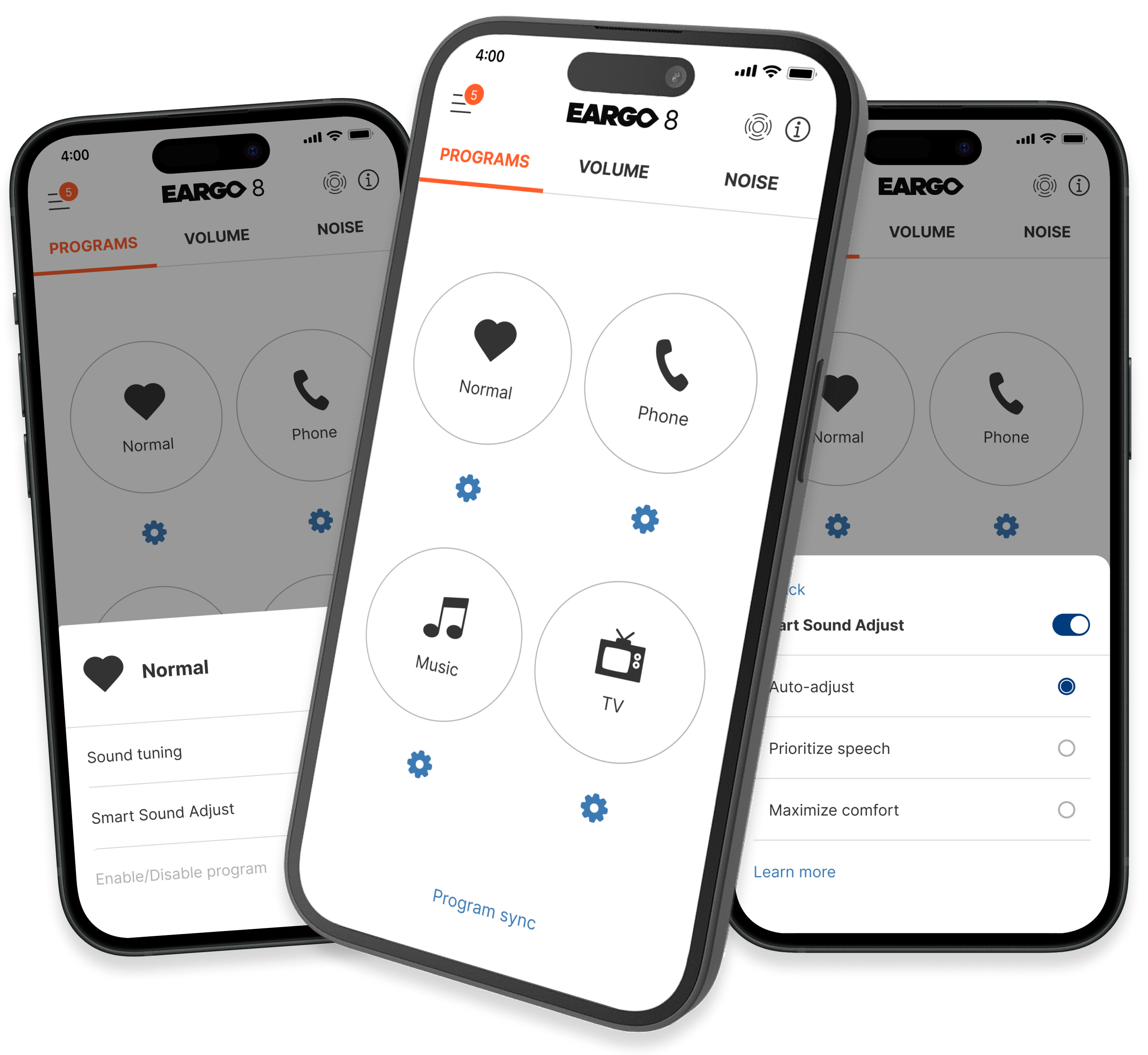
The path to editing hearing programs was unclear and slow. I redesigned the flow end to end, giving users a clearer, faster way to adjust their programs.

Problem
  • Multi-step editing flow — what should have been a quick change took users through many separate steps.
  • Unclear edit action — the edit button on the original screen didn't make clear what users were actually editing.
Solution
  • Tied editing to the program slot — the edit action now lives directly on the program slot, making it clear which program is being edited.
  • Larger touch targets — emphasized each program's touch target for easier, more confident interaction.
Outcome
  • Clearer available actions — users better understood what actions were available to them.
  • Less confusion when editing — users had a clearer sense of what their changes were actually doing.